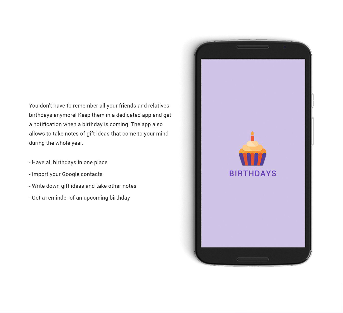


A cupcake idea has been chosen for the app launch icon to visually express the product. The icon is crafted in accordance with material design rules to represent the tactile and physical quality of the paper. The icon is simple, bold, and friendly.
The color palette comprises primary (purple) and accent (orange) colours. Purple is a very impressive, stylish, and romantic. This colour suggests reflective moodiness and mystery. Orange is festive. It represents joy, cheerfulness, excitement, and energy.